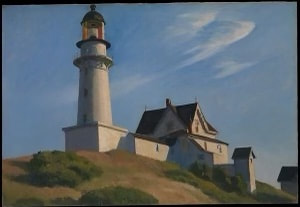
There are lots of paintings for this time of year. Here are a few.
I’m listening to Frederick Delius’ On Hearing the First Cuckoo of Spring. I listen to this piece every spring, and I only listen to it in spring. It’s a listen I look forward to throughout the year.
Delius’ wife was a painter, Jelka Rosen (1862-1935). I suppose hers are as good as any entrypoint into springtime paintings. Rosen was a German heiress. In Paris she crossed circles with Rodin, Gaugin, Maurice Ravel and other such artists and musicians. After Frederick's sojourn into business in America, he and Jelka were married, and lived in France. Rosen’s paintings are light, and colorful. They’re nice weather paintings. Good paintings for Easter Time.
In Rosen’s painting of her husband, Delius in his Garden in Grez sur loing (1908), the whites and light colors are a structure that invites you in with the warmth of a pool of sunlight. They crystallize on the surface. They are like formed marshmallows and marble dust. Paintings like this are tactile; you feel the sunlight, and taste pollen. The flowers and the earth are in spring’s bloom. This picture tastes like a dram of syrupy spirits.

Delius in his Garden in Grez sur loing (1908)
Thomas Hart Benton (1889-1975), an American from Missouri, also has springtime paintings. Girl in Park, painted by Benton in his early 20’s, differs from the robust regionalist style for which he is commonly known. It’s similar to impressionist, and post impressionist works, from which he was clearly drawing influence. It fits well with paintings like Jelka Rosen’s.
Benton’s painting After Many Springs (1945) keeps better with his famed allegorical style of depicting 20th century American life. It riffs on his earlier painting After Many Days (1940). Both feature skulls disappearing into brushy coverts. As if in a dream or memory. The skulls pass undisturbed from sight, while life continues and knowledge of their existence fades. After Many Springs includes an old revolver along with the skull, and, on the horizon, a farmer steadily tills his field. Ashes to ashes, dust to dust. The deeds and misdeeds of our seasons pass quietly, and fertilize the future.
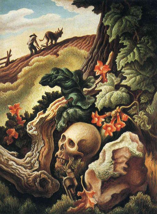 After Many Springs (1945) |  After Many Days (1940) |
Benton’s Cave in Spring (1963) shows a man napping by the side of a river, while his canoe floats nearby. Benton adeptly painted gradations of light in the river. There is reflected light from the sky and the rocky landscape, as well as dark colors to show depth at the river's bend. He used a gradation of green to show river grasses disappearing into the clear water.
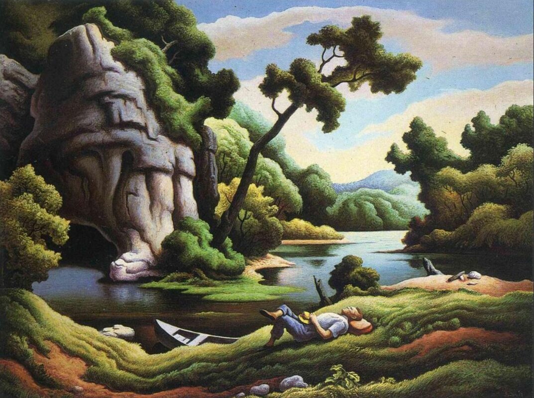
Cave in Spring (1963)
I go between two interpretations on Cave in Spring. The picture invites you into arcadia. It is a dreamy scene with homage to the landscape’s allure. But, maybe there is darkness in the dream. The bow of the canoe points to a black cave that drinks the river. In light of his earlier After Many Springs, it seems, Benton perhaps accented spring with hints of doom.
In Cave in Spring you can hear the bucolic language of a Zane Grey or a Washington Irving story, but youI also hear the eloquent bleakness of Cormac Mccarthy (also known to allegorize the human condition with images of caves), or the darker passages of John Steinbeck. It’s a place you want to go in a daydream, but perhaps in your lulling travels you find some holes. You look down and see a skull under brushwood. Like Rip Van Winkle, you take a drink, fall asleep, and wake to find your country has changed. You look down a dark cave and glimpse starkness in the human condition. It’s a starkness barely, but serenely, covered beneath the loamy surface above.
Andrew Wyeth (1917-2009) lived in Pennsylvania and Maine. He often made seasonal paintings. Spring (1978) was his grief painting for the death of his friend Karl Kruener. In this painting Karl’s remains lie in a thawing snowbank. Spring echoes Wyeth's 1946 painting simply called Winter.
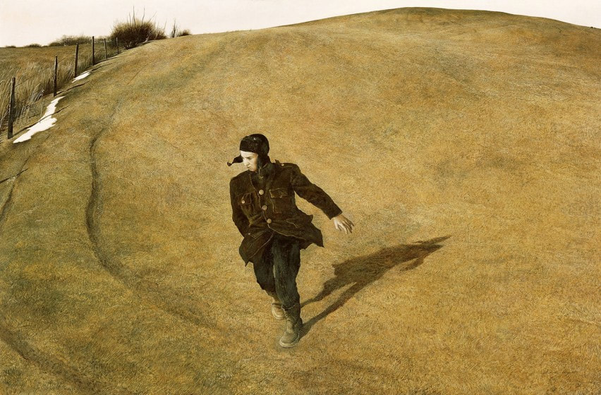
Winter (1946)
Winter was Wyeth's grief painting for the death of his father N C Wyeth. Both paintings are set on Kuerner Hill near to the place where N C died when his car was struck by a train. Winter shows a boy along a fenceline on the hill. His clothes flap while he turns on his toes midrun. There is an open field behind him, but he seems like a scared deer trying to outrun the fence. He looks down at tire ruts in the soil. Despite his familiarity with the place, the boy is lost. There is weight of beared influence as one generation makes way for the next.
In Benton’s springs we peer down holes to see the collective past’s power. In these Wyeths the allegory of endowment is front and center. Three decades passed between Wyeth’s Winter and Spring. Nonetheless, they are painted with notable similarity. They are pictures of the same place. Grief feels much the same now as it felt then. While Spring is more openly morbid, it is the more hopeful painting. Winter’s end is spring's beginning. With Spring Wyeth painted wisdom into his friend's passing. Two parallel sets of tire ruts head up and over the hill. Here the artist knew his way out. A sliver of moon and a bit of snow balance the mostly empty composition. Benton's skulls show how man's deeds, in all their violence, collect to inform his future. In Wyeth’s Spring this undergirding violence is accompanied by love for one's friends.
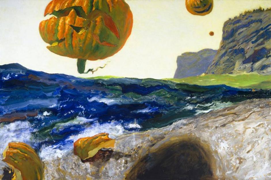
In Wyeth’s Airbourne (1996) white feathers drift through the air of the painting. Like Jelka Rosen’s Delius… , here again you look through the whites to meet the picture. But, the whites in this painting are more a screen than a structure.The feathers in this picture are sparkles in your vision. The sun burns through the haze and the scene glows. Ambient and brilliant. The shapes in this picture are crustal slabs. Cool and smooth. Here, like in Rosen’s spring, earth’s fertility is on display. But, here the fertility is tectonic. Rather than warm you with spring’s sun, Airbourne sweeps you up as the world leans on its axis.
These paintings all drift into allegory with the dreaminess of Delius’ springtime music. These are daydream pieces. As I listen to On Hearing the First Cuckoo of Spring, I close my eyes and let my mind go. And, I do this with no intention. I let the music take me where it will. In much the same way, I look at these pictures and let them take me where they will. Impressions of gardens in bloom, or thawing banks of snow. I may find skulls at rest beneath undergrowth. I may float. A drifting feather or a canoe on a river.
Pictures come with us. One season after another. Soon I'll be listening to Delius’ A Song of Summer.