TED WALSH
  • Home
  • Essays
  • Selected Work
  • Archive
  • About
  • Contact
  • CV and Bio

Have yourself a merry little christmas

12/24/2022

0 Comments

 
Picture
One of my favorite things, especially at this time of year, is paging through one of my big beautiful art books. These days, with toddlers running around, and a lot of general life bustle, I have less time for it. But, while, maybe, I’m less relaxed, my fatherhood provides perspective on how to better see the world, and so better see art. 

The other night I had a moment, and sat down with a big architecture book. Right away, Georgie was next to me saying, “read it to me?” So I got him on my lap to read. He’s less excited than me about federal style facades. We changed to a Norman Rockwell book with a lot of pictures. He likes those. We also paged through some NC Wyeths. He likes those too. Both Wyeth and Rockwell had some great Christmas time pictures. George likes seeing Santa in there. 

At bedtime I sing to him. Lately I’ve been singing Christmas songs. He loves Jingle Bells, and We Wish You a Merry Christmas, so I start with those. Then, as he nods off, I sing Have Yourself a Merry Little Christmas. This year, it's just been feeling like a special song.

Frank Sinatra did it well. But, in my head, I hear Judy Garland's voice. There’s something so palpably lovely when she’s singing it. That voice. The skill, and natural beauty. The emotion. I don't know. I can’t really write it. It’s just perfect to listen to. 

And isn't that something to do with art? The thing you can’t really write down or define well. But you want to company with it. What else do you do, but make that into art? And, while somewhat intangible, the really good stuff is still intrinsically accessible. It feels deeply healthy. And so, you make and share art, music… etc. because it's a humane thing to do. 

I'm a ‘Great American Songbook' guy, and I like musicals. Have Yourself a Merry Little Christmas is originally from Meet Me in St Louis(1944). I’m not too familiar with the show. But, the basics are Judy Garland plays Esther Smith, and she sings Have Yourself a Merry Little Christmas to pacify her young sister Tootie Smith who is sad because the family have to leave their home and move to New York after the holiday.

It's a check yourself in song. In the face of your worry, make the yuletide gay. But, it's not a brashy in the face of worry song, like I Got Rhythm, or I Got the Sun in the Mornin’. Big broadway feelgood stuff. The quiet of Have Yourself a Merry LIttle Christmas is a beautiful artistic choice. A perfect meditation for the season. To address your own fears and worries is inextricably connected to making the place brighter for those around you. A caring communal act for the shortest days of the year.

Picture

​Have Yourself a Merry Little Christmas probably pairs well with a lot of paintings, but I’ve been thinking of George Bellows’ Pennsylvania Station Excavation. It's a winter scene. Loosely painted and tonal. It depicts a massive crater dug for construction of the old Pennsylvania Station in New York City. Bellows painted it in 1907-8. Meet Me in St. Louis is set in 1903-4. If I was little Tootie Smith on Christmas eve 1903, building a snowman in the yard, and I saw this Bellows’ picture of New York City I’d need comforting.

Pennsylvania Station Excavation is a stormy painting, cold, dark, smoky, and strong, but I like how it comes across if I look at it and listen to Have Yourself a Merry Little Christmas. A meditative overlay on the cold real of the world. There’s always another layer. If you clear your eyes, or maybe your head, or maybe let your heart be light you feel the painting. A scene moving through time. What was here before. What is here now. What will be here next year. The snow falls on places, the skylines change, our emotions come with us through it all, and, maybe, next year all our troubles will be out of sight.

The old Pennsylvania Station from Bellows' picture was eventually torn down. In its place they built Madison Square Garden with today’s Penn Station a series of tunnels and concourses scurrying along underneath the arena. For me, a Flyers fan, it's kind of fun to think the ugly home arena of the New York Rangers wasnt always there, and someday could be replaced with a beautiful structure. Layers of history.


Picture
When I first had kids, I was surprised by how much babies like being sung to. Maybe I could have expected it. There are few things more elemental than singing to babies. I think, cradle singing had just seemed symbolic to me before. But now, it’s among signs there are uses for arts that are just at the foundation of being human. I think, sharing cheer this time of year might be similar.

This kind of inspiration can be hard to come by in the art world. So snuggle up with a Holiday song or a movie musical. Or a painting of Santa Claus, or of a big snowy hole in industrial era New York. The honesty and truth in good stuff made by great artists will help provide an extra layer of solace conducive for communion with those you hold dear. 


0 Comments

Headlands of Monhegan

10/23/2022

0 Comments

 
Picture
Jack o’lanterns soaring off the cliffs of Monhegan and smashing on the rocks below. Cold water, and pumpkins. I love this painting. It’s one of those delicious paintings. It depicts a seasonal ritual on Monhegan Island. Tiny figures atop the island's steep rock face toss jack o'lanterns down toward the roiling surf. 

Jamie Wyeth is a great painter of pumpkins. Some are dreamily American bucolic. Think of the wonderful details in a Washington Irving story. Others are more halloweeny. Think of, well, the wonderful details in a Washington Irving story.

Headlands of Monhegan is of a style more recent to Jamie Wyeth's work. Maybe the best way to describe it is playful rock and roll. Think of the Grateful Dead or Little Steven’s underground garage. You can imagine Steven Van Zandt’s voice announcing, ``this week's coolest painting in the world is Headlands of Monhegan from Jamie Wyeth.” It’s a painting with playful swagger. 

The pumpkins appear jauntily sinister as they laugh their way toward their demise. The composition is impish. There is a black hole at the bottom. It's the shadow of the central jack o’lantern and it looks like a manhole to hell. Wyeth’s earlier Pumpkin Shadow has a similar hole of a shadow. But while Pumpkin Shadow is a perfectly still picture of autumn mood, Headlands of Monhegan is a rakish devil may care picture. It’s bold and painterly. The gourds appear otherworldly as they float through the air. The rocks below, flecked with shards of orange fruit, are painted with ropey dashes of gray and white. Passages of underpainting show through to give the surface a lively, organic feel. 

In this painting, the cold North Atlantic is blue, white, and green. The deep blue is emphasized by bright white breakerfoam. The blue and white are adeptly offset with the slice of lime green on the water’s surface. These three colors cooperate with the vibrant orange pumpkins for a wonderful halloween harmony. The juxtaposition of the green and blue are another echo of an earlier Monhegan painting. Wyeth’s Twin Houses of 1969 is a great painting that uses similar color geography at its horizon. 

In addition, the depiction of the sea in Headlands of Monhegan is wonderfully cinematic. It seems as if you're seeing above and below the water at the same time. Think of split water photography; shots that straddle the water’s surface, often used in footage of surfers. 

At the Jersey Shore in the fall, when the weather and tides become right, the parking areas fill with old Ford Broncos decorated with coastal bumper stickers, old Jeep Wagoneers with wood panel sides, and funky bicycles outfitted with surfboard racks. You can sit on the sand and watch surfer dudes make their way down the beach and into the water. The fall waters are rougher and colder than those of summer days when you splash around with your kids. In these waters, the surfers know what to do. I've always admired, even envied, these dude’s ability to be one with the place.

I feel the same way about great painters on Monhegan. In ways, the painter is the ‘surfer dude’ of Monhegan. The history of the island, the culture of the island, the beauty of the island… Many things about the place make painting a top way to be one with Monhegan. And, possibly, the prime example of the yoga that is painting on Monhegan, is Jamie Wyteh painting the headlands. And, to boot, it's a great pumpkin painting.

Many paintings of Monhegan Island are bucolic. Calm and beautiful. I love them all, but Headlands of Monhegan is both a perfect painting, and a perfect celebration of the joyful dignity of the island’s no frills tradition. It’s utterly in tune with the wild power of the place. You can hear those waves smashing the rocks. The waves swallow up the pumpkins like they swallow up the preceding summer’s tourist season. This painting swallows you up. You’re in the splash zone here. And what else can you hope for in a painting? It's just right for fall, when the water is cold and the spirit of jack o’lanterns is in the air.
0 Comments

October 17th, 2022

10/17/2022

0 Comments

 
0 Comments

Between one thing and another

9/27/2022

2 Comments

 
One is a hot summer picture, and the other is a brisk and windy picture, but Edward
​Hopper’s Summertime and New York Pavements are kindred paintings.

Picture
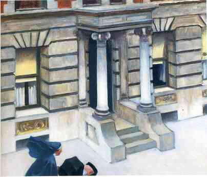
In New York Pavements a nun/nanny pushes a baby carriage on the sidewalk. A headwind blows her veil back. But for the baby, she is alone. The brush strokes are prompt and efficient. In all but the lightest areas, (the columns, the bottom parts of the building, and the baby’s blanket) the paint is thin. A dark underpainting shows through the top layers to outline and delineate architectural detail. For a Hopper picture, the color is muddy. It seems he mixed most of the color on the canvas as he was painting. 


Picture
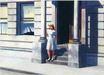
Summertime is a hot picture. This girl here is not a nun. We see through her dress, and get a dose of nipple and upper thigh. She is paused on the front steps of a building. A slight breeze touches her dress, and moves some curtains in a nearby window. She is taking in the sun. She is alone. The paint in summertime is thicker than in New York Pavements. The shapes are cut shapes. The architecture is not defined by draftsman-like underpainting. Instead it is defined by the shapes of color that fit together like puzzle pieces. The paint in this picture feels like heavy slabs heating in the sun.


I waiver in my conclusions about these two paintings. At first, both compositions seem a little awkward, and maybe even a little lacking. They fall a little flat. It seems there are oversights, missed opportunities to show depth, activate space, and create dynamic compositions. But then, the pictures resolve, and feel quite intentional. Maybe there aren’t missteps. Maybe the pictures are purposefully uncomfortable. Maybe, in fact, what makes these pictures work is their cumbersomeness. 


The heavy shapes in Summertime push forward, and make the composition feel dense and stuffy. It's stepping outside into a wall of bright sunlight. It’s the suffocation you feel when you can’t get away from the city heat. The slow still of summer in the east. 


On cold days in NY the buildings are hulking blocks of concrete, and people are tiny figures, rushing around between them. The brush quality in New York Pavements is hurried. The figure at the bottom barely makes it into this picture. In winter and late fall in NY, you don't stop to linger. You move quickly. You can't get away from the cold. The grubby gray pavements are pervasive. The cold facades offer no relief from the sidewalk's chill. 


Now, am I playing with words to countenance my own opinions about Hopper's pictures? A lot in both paintings may just be coincidence, or simply be by dint of Hopper's natural hand. Maybe his concentration was all together on different things. Hopper kept meticulous sketches and notes about many of his paintings, so with some studying perhaps we could come to hypotheses about his intentions. But Theories about painterly intention require more time and thought than I want to dig into here. Still, I’m struck by one thing for sure, these two paintings, like many of Hopper's paintings, are both unashamedly sincere. This type of honesty runs throughout his oeuvre. His subjects are subjects of common ground, and simple human truth.  You don't have to be an expert to relate to a Hopper picture. Summer heat. Winter winds. They're pictures of relatable basics. They're easy to look at. Hopper paintings don’t make declarations. They don’t put conditions on the viewer. They don’t tell you how or what to see.  And, well, they’re pictures that are very popular.  


Hopper often worked with variations on themes. It's great fun to see how he handled similar subjects in different ways. His are perfect entrypoint paintings. They're pretty easy to think through. They exist plainly, and also have considerable artistry. You can choose to enjoy the paintings however you’d like. With both Summertime and New York Pavements, it seems, Hopper earnestly allowed the paintings to take him where they would. We, in turn, can simply go along with him. This is the great zen of his work.


Hopper tended toward depression and was likely a prickly guy. But, his work brings you in gently. This type of care, artist for viewer, takes confidence in feeling, and real know-how. Hopper’s work never hides behind the frivolous. Whether he knew it or not, Hopper gave us truth in simple things. A girl steps out in the summer. A woman faces the wind, and cares for a child. Great masters don’t necessarily need to flaunt their mastery. Let the painting be in earnest, and maybe the rest will fall into place. So, if my thoughts about these two paintings waiver, that may just be my problem. Hopper pictures worked for plenty of folks before I was born, and they will likely continue to do so for a long time. 


​

2 Comments

A few words about Sunrise by George Inness

9/4/2022

0 Comments

 
Picture
Don’t delay or stay too long, meet us at the break of dawn.

Sunrise by George Inness could be an off putting painting. It’s a hazy picture, made of orange, green, yellow, brown, and gray blears. But, while it’s somewhat ugly, it’s intriguing. It draws you in. You can feel the place in this landscape.

With this painting, you wake to early sun burning through morning mist. There is a kind of magic when you step outside to feel golden heat and cool vapor touch your skin at the same time. This painting sounds like Grieg’s Morning Mood, and the Adagio from Brahm’s Piano Conerto No. 1 playing simultaneously (Try giving it a listen, it’s more beautiful than you might expect).  How do you paint the ethereal? And then, how do you describe the painting of the ethereal?

George Inness' imagery is evanescent. You feel like you can’t quite see his pictures. They are dreamy, but they’re not frivolous. His compositions often feel as if they will fail at any moment. But, they don't. He painted tightly within the envelope of the given images, but also with freedom and expression. His pictures are often quite abstracted, but, to the gut, they never feel like anything but true to life. He disregarded painterly posturing, and instead favored his sense of honesty. They’re paintings about his expression, but they’re not paintings about him. His creations represent his awareness of collective sensations of people and their landscapes. With Sunrise Inness painted the practical, soily chlorophyll landscape. He also painted the screen of midsummer’s fairyland fog through which you see this landscape. 

This dawn has summer ghosts. A figure, in silhouette, makes his way through the landscape. Is it a plowman yawning as he begins a long day’s work? Or is it a puckish hobgoblin, yawning as he slips home after a long night of mischievous wandering? This dawn is a beginning scene, and an ending scene.

In parallel, the craft of this painting has productive divergence between its component parts. What you might at first see as disunion, resolves into well crafted harmony. This painting feels as if it were spilled rather than painted onto the canvas. But, it doesn’t feel thin or watery. Most of the picture is sufficiently built up. But it’s not built of dutifully alternated glazes and scumbles. When necessary to his vision, Inness freely toyed with painterly convention. His paintings have a vibe more than they have a beauty. In this painting, the careful gradient of light in the sky - orange to yellow to red - is reminiscent of the smooth color rich skys of the Hudson River School. But, in order to create morning mist, Inness painted a drab, gray wash over the bulk of the sky. He let only the brightest light of the sun burn through to become the focal point at the center of the picture. 

Blurry patches of greens roughly imply bushes, tree leaves, and banks of grass. Over these patches Inness laid gentle flutters of color to make more specific bits of foliage. For these, he simply touched the side of his brush to the surface, and let the bristles do the work. Inness’s creative mark making is compelling. In places he turned his brush around, and scribbled into the wet paint with the brush handle. For texture in the tree branches, he chicken scratched a dry scumble. But, for this scumble, instead of a local color in reference to the tree itself (i.e. the color of leaves or bark), Inness used the same warm tonal black that he used as a glaze throughout the rest of the picture. He simply varied his handling of the same paint for different effects. It’s the kind of efficient and painterly pluck you love to see in the work of a great painter.

In Sunrise, Inness adeptly handled the diverse components of his painting until they coalesced into a morning’s majesty. It's a visual epilogue that comes at the end of a midsummer’s night of dreams. So, “don’t delay or stay too long, meet us at the break of dawn.”

0 Comments

Fly me to the moon

6/23/2022

1 Comment

 
Three dogs
at a party
on a boat
at night.


I’ve been reading Go Dog Go to my son lately. It's his favorite book of the moment. I’ve been thinking about this picture. 

Related to the Latin mensis and the Greek men, and the Latin mentiri meaning measure, our word “moon” is created of quantification and frequency. While it is one of our greatest measuring devices, it also pervades our elan vital. And, perhaps these two purposes are more similar than at first they appear. It measures. It also oversees. It seems to me, for this reason, moons are everywhere in our art. So where do we start? Here are a few moons in art.

Picture
Picture
In John McNeill Whistler’s Nocturne, Blue and Gold, the orange/gold moon is a bit of design. It tangents the hazy horizon and offsets the understated monochrome composition. 
​ 
​

Picture
Andrew Wyeth also uses the moon compositionally. The small moon in the upper left of Spring balances a bit of white snow in the upper right. It also adds depth to the picture, as the other elements in the landscape are relatively close to the viewer in this scene.


Picture
In other paintings Wyeth uses the moon as a light source. In his excellent Night Sleeper the moonlight illuminates a white barn in the landscape, and slivers of moonlight define window frames and a dog sleeping on a sack. As a younger artist, I didn’t like this painting. I preferred Wyeth’s bleaker scenes, and his gritty, splashy water colors. But, this painting has grown on me. It’s a bit whimsical, and oddly composed. It feels like three paintings. Each window is its own picture. There’s a classic 18th century Pennsylvania barn out one window. Out the other is a silver stream in a perfectly minimal landscape. It’s a picture that feels like a dream. The juxtaposed moments puzzle together and feel completely natural.


Picture
Henri Rousseau also uses the moon as a light source. The Sleeping Gypsy has similarities to Wyeths Night Sleeper. The moon lights the scene brightly, and the gypsie‘s sack clothes remind me of the bag where Wyeth’s dog rests his head. The oddly placed elements in this composition make it feel like another dream you can't quite describe. 

​

Picture
Rousseau’s Carnival Evening is an excellent moonlit scene. The moonlight filters through the trees to light a couple in carnival garb. There’s an odd structure tucked into the right side of the picture on the edge of the woods. The figures are lit more brilliantly than the rest of the landscape, and the architecture of the building seems beyond logic. Here is an epitome vision of the dreamily surreal.


Picture
In Man and Woman Contemplating the Moon, Casper David Friedrich’s moon is part of the narrative. Here the scene is romantic rather than surreal. Once again moonlight filters through the trees toward a couple in the woods. They are silhouetted against the sky. You can step into the moment. There is magic in contemplating the cosmos with your hand on a loved one's shoulder.

​

Picture

Francisco Goya makes the magic of the moon sinister in the Witch's Sabbath. This picture is painterly and brusque. Here the moon tells us it’s night more than it lights the scene. The witches gather around a cartoonishly disquieting goat as clumsy bats flap around his head. This is one of Goya’s many paintings of witches, the wicked, and the fiendish. There’s plenty here to make you double take. The melting faced figures offer babies and skeletal children to this nefarious coven. The roiling landscape appears to be either dead gray hills or an agitated gray sea. The moon is a dirty dash of white that hovers lazily above.

​

Picture
J.M.W. Turner is a painter who is known for making landscapes roil, but Moonlight, a Study at Millbank is one of his calmer pictures. This composition is similar to Whistler’s Nocturne Blue and Gold. Turner’s glowing moon is the focal point in this monotone picture. Its light glints off the water, and silhouettes the boats and horizon. The foreshortened reflection of moonlight on the water’s surface provides an avenue you can walk along into the picture. It's a line of perspective. 


Picture
When I was in art school, I had the opportunity to watch Vincent Desiderio paint, and listen to his eloquent musings on painting, painters, art, and life. He related moonilght’s reflection on water, as in Turner's painting, to the lines of convergence in one point perspective. With this kind of perspective, the vanishing point is determined by connecting the artist's eye line to a point of convergence on the horizon. Desiderio described this line of sight as a direct path from the eye of the artist to the eye of god, or “the ineffable one.” This line is unique to the point at which each artist stands. Similarly, the direction of moonlight's reflection on water is unique for each one of us. It travels directly to each individual wherever they are standing. There are as many different reflections as there are people standing and looking. A well built artwork allows you to step into the artist’s point of view; the artist’s connection with infinity. 


Picture
Alan Watts, the interpreter of zen culture, said, “when the moon rises, all bodies of water instantly reflect the moon.” Odilon Redon says it well with his lithograph,  À Edgar Poe (À l’horizon l’Ange des Certitudes, et dans le ciel sombre, un regard intérrogateur)
The moonlight provides practical visual structure in the picture, and it also provides the narrative of infinity. The moon measures, and oversees. 

In his song Shore Leave, Tom Waits tells a similar sentiment. His language, while poetic, is couched in a down and out, homely attitude: 

And I had a cold one at the dragon
With some filipino floor show
And talked baseball with a lieutenant
Over a singapore sling
And I wondered how the same moon outside
Over this chinatown fair
Could look down on illinois
And find you there

And, well, who can forget Cookie Monster’s moon.
https://www.youtube.com/watch?v=-3U3Sby4zko


Picture
Soon enough it all comes back together. There is a scene in It's a Wonderful Life when George Bailey is courting his love interest, Mary. He takes a walk, and finds himself at her house. On seeing his arrival she places a drawing she made onto her easel. It is a cartoon of George, and he’s lassoing the moon with a rope. George is a young man with big dreams. When he sees the drawing, George sees his life lay itself out before him. He’s terrified and in love. He realizes his love is reciprocated, and he realizes this love will overpower everything he's ever considered doing. They kiss passionately.


Circumstances have brought me to settle back in my hometown. It wasn’t necessarily a goal I had as a young man.Still, I'm happy. I’m married to the love of my life, and it seems like we keep having babies. When I was a kid I didn't like the scene of George, Mary, and her drawing. I don't think I fully knew what it meant. There was too much kissy stuff, and frankly his fear of future regret made me scared and worried. Now I love this scene, and I can't watch it without tearing up.

​

Picture

On one poster for the Broadway show, Crazy for You, two lovebirds sit with arms around each other by the arch of a crescent moon. It's a great show with Gershwin music, and plenty of comedy. There's a dreamy song near the end called Nice Work If You Can Get It. When I'm feeling down, especially if I can't sleep at night, I listen to Nice Work If You Can Get It. It reminds me how much I love my family, and then I’m walking on the moon.


​

My most resent moon painting.
Picture


Day Moon and Coming Dark, oil on panel, 28x17.5 
currently at ​www.robertlangestudios.com
1 Comment

Intro to this Blog

6/13/2022

4 Comments

 
I love looking at paintings. It’s high on the list of my favorite things to do. I love making paintings. It’s another of my favorite things. I also love writing about paintings. Of these three, I’ve professionally engaged with writing the least. There are probably a number of reasons for this. Some are good, and some are likely not so good. Maybe it's a lack of confidence. Sometimes I tell myself, I’ve been busy working on other parts of my creative process, and maybe this is true. Maybe it’s just been absent mindedness on my part. But recently I’ve had some requests to start a blog, and put my ideas about painting, art, etc. out there. Well here goes. 

​
Picture
4 Comments
Forward>>
Powered by Create your own unique website with customizable templates.